I know I’m late to the party with this, but I finally watched THAT Game of Thrones episode the other night, and despite half expecting something shocking due to having heard loads of people talk about something dramatic happening in the third season, I still wasn’t fully prepared for what unfolded!
SPOILER ALERT!
I like this quote from George R.R. Martin who talks about the ‘Red Wedding’ being inevitable after he killed off Ned Stark
I killed Ned because everybody thinks he’s the hero and that, sure, he’s going to get into trouble, but then he’ll somehow get out of it. The next predictable thing is to think his eldest son is going to rise up and avenge his father. And everybody is going to expect that. So immediately [killing Robb] became the next thing I had to do.
END SPOILER!
This made me think about how powerful unpredictability can be, and how George R.R. Martin had managed to use that to his advantage to help create something that sticks in your mind for much longer than if something completely predictable had happened.
Now if we compare that to web design, we’re often told that doing something unpredictable could result in users getting lost, confused or frustrated, none of which is something we want to aim for. But what if we could put a little unpredictability into our websites, not enough to confuse or anger the user, but just enough to make them remember the website, hopefully in a positive way. Wouldn’t that be great?
So what type of unpredictability can we put into our designs that could generate that type of effect? Looking towards a slightly different medium can hopefully provide the answer to that. Linguists have demonstrated that compositions written in a random
order can successfully evoke semantically meaningful images when read. Elizabeth Drew and Mads Haahr examined this in their discussion of Samuel Beckett’s prose piece “Lessness”, in which Beckett used random permutation to order the 60 sentences of the story; reading the story draws on an appreciation process that is dependent on the reader’s attempts to comprehend and create meaning. Why randomness becomes significant in the experience of the story is, as argued by Drew and Haahr, because the absence of an obvious determinism provides a gap in understanding and thus spurs the reader’s interaction with the piece. They see randomness as a means to create a “blank” that induces and guides the reader’s constitutive activity.
This made me realise that designers have been using this concept of unpredictability for ages, by using things like “white space” and “breaking the grid” while still keeping a focus on things like clarity and precision.
By intentionally creating a little unpredictability, ambiguity allows designers to engage users without damaging their experience.
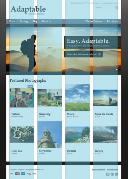
Of course, responsive design adds a new set of challenges to this, and I think that the reason that responsive design has sometimes been accused of being “boring design” in the past is due to a lot of designers blindly adhering to grids and not allowing for any “white space”, probably in an attempt to keep the design layout as easy as possible, so that changing it to fit multiple screen sizes doesn’t cause any problems.

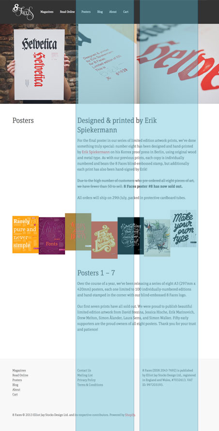
As the process has evolved, designers have realised that they can still include these areas of unpredictability in their website designs and still make them responsive. A great example of this is the new 8faces site, especially on their posters page, where the row of posters visually breaks out from the body of text that it’s placed within when viewed on a wide enough screen.

Hopefully this has helped to highlight that a little unpredictability in your designs can be a powerful thing, but use it carefully!