I’m rubbish at recognising fonts and typefaces!!
Not the best thing for a graphic designer to admit, but it’s true!
Sure I feel confident in choosing the correct font for every design project that I’m asked to work on, but if someone shows me a piece of typographic design and asks me what the font is, chances are that I’ll just stare blankly at it for a while before suggesting they check what font it is by using some type recognition website like whatthefont.com.
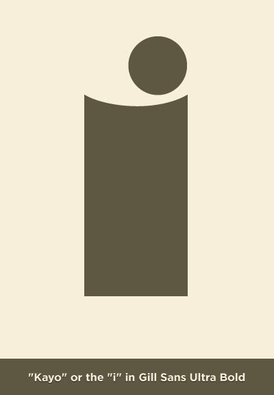
Due to this typographic weakness in my design skill set, I’ve been trying to improve my knowledge of type and individual letters from certain font families which led me to discover “Kayo” or the “i” in Gill Sans Ultra Bold which you can see below.

It was (typographic) love at first sight for me. I love how it seems to be a character with some personality and a bit of humour. With the dimple on top of the stroke and the dot out of centre, it’s form at first glance seems a bit weird, but that makes it all the more interesting. It’s an inquisitive ‘i’ that’s peeking over the tip of bowl that it’s been placed in, to get a good look at the character standing next to it.
Incredibly it was all the way back in the previous credit crunch somewhere between the years 1928-30 that it was created by Eric Gill and somewhat appropriately this typeface has got it’s own nickname. Originally I couldn’t find out why it was called “kayo” but thanks to looking through an old issue of Grafik I discovered that it derives from K.O,. as in ‘knockout’. It makes sense really – an ultra bold character being a heavyweight champion…..it seems like a friendly giant to me though, which it why it’s now defiantly a character from a font family that I won’t forget….until they start showing me different weights of it of course! :s