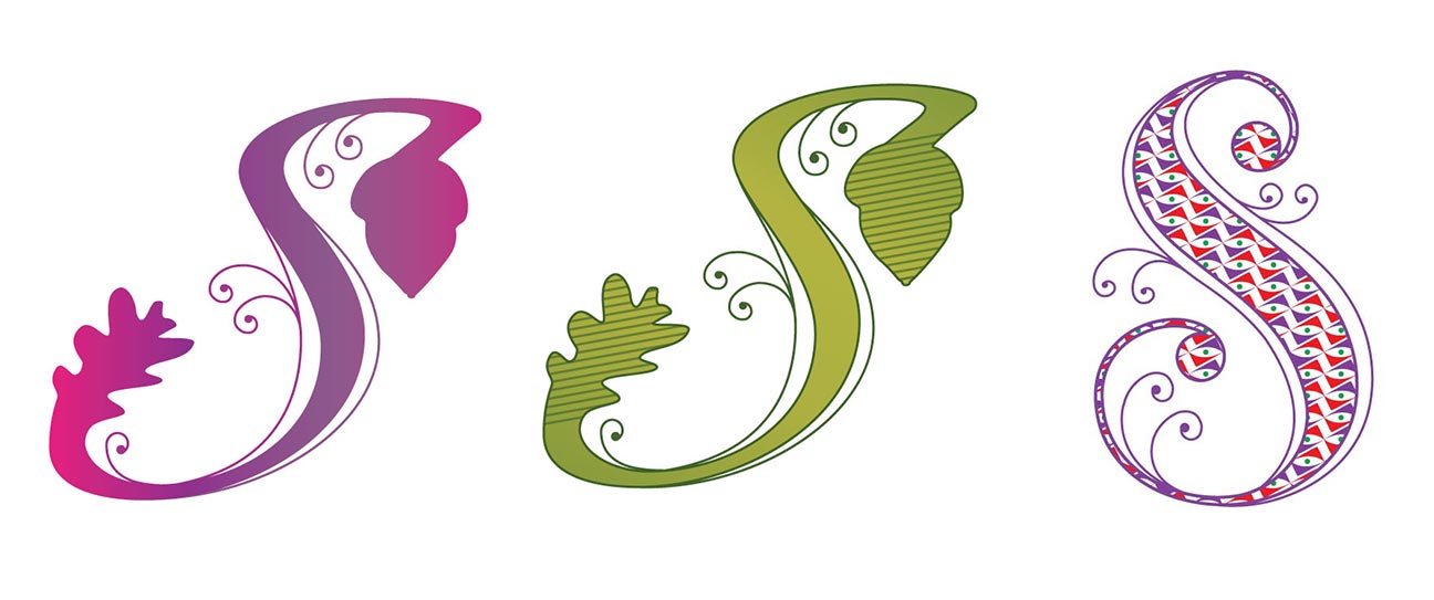
This is a drop cap letter “S” that I designed for a client who wanted to be able to use it in her blog posts as well as for other online uses.
A drop cap is the first letter of a paragraph that’s of a much bigger size than the rest that follow. The letter formatting is such that the letter “drops down” to cover the few lines following the first one.

When designing a drop cap, it is important to start with a well balanced letter shape otherwise there is a risk of the finished letter seeming unbalanced once it has had all the ornate swirls and decorative elements added to it. The differences in weight of this letter ‘S’ and making the swirls flow with the body lines help this letter retain it’s balance even at small sizes, like when it’s put into a blog post.
