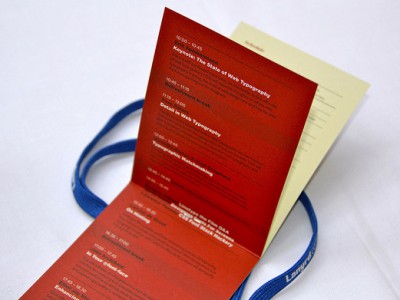
I like Brighton, in fact I’d even go as far as saying it rivals Bristol as one of my favourite places in the UK, not least because of the great design and creative crowd it’s famed for, so it seems strange that I’d never attended any sort of conference there before now. That was thankfully… Continue Reading +
Posts Tagged: typography
Why Photoshop CS6 is going to rock my ‘web designer’ socks off…hopefully!
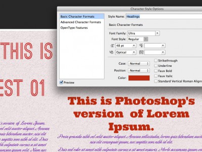
As most of you already know, the Photoshop CS6 beta has been available for testing for a little while now and after taking a look at it, I’ve noticed that it includes a ton of improvements over previous versions. Some are big and some are fairly small changes, but they seem to have really done… Continue Reading +
I love typography but…
I’m rubbish at recognising fonts and typefaces!! Not the best thing for a graphic designer to admit, but it’s true! Sure I feel confident in choosing the correct font for every design project that I’m asked to work on, but if someone shows me a piece of typographic design and asks me what the font… Continue Reading +
Drop Cap letter “L” – 8 Faces Competition
Below is a drop cap letter “L” that I designed as an entry for a competition that was run in the first edition of the “8 faces” which is a magazine for devotees of typography . I was attempting to create it in an ornate style, in homage to the intricate marks and swirls of… Continue Reading +


